
Every time you log in, the dashboard greets you with the headlines — what your team’s been doing, how your usage sits against your plan, and quick ways to get going. A calm starting point, not a wall of data.
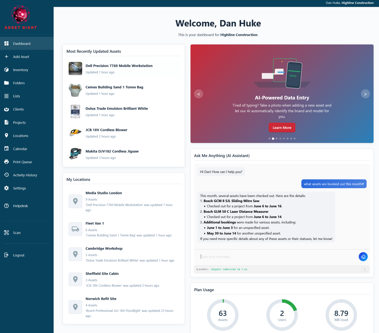
The headlines, front and centre
The dashboard surfaces the handful of things that are genuinely useful at a glance:
- Recently updated assets, so you can see at once what the team’s been working on.
- Plan usage, with clear dials showing your assets, users and storage against your limits.
- Quick actions, jumping you straight to adding an asset, scanning, or running the setup wizard.
- The AI assistant, ready to answer a plain-English question without leaving the page.
A calm starting point, not an information dump
The design intent matters here. Rather than overwhelming you with every possible metric, the dashboard deliberately shows just what helps you orient yourself and get moving. You always know where things stand the moment you arrive, and the next useful action is never more than a click away. For an owner or manager checking in between jobs, that means a five-second sense of “all’s well, here’s what’s happening” rather than a research session.
In day-to-day use it’s the natural home base:
- Log in and take in the headlines — recent activity and usage.
- Ask the assistant anything you’re wondering about your inventory.
- Jump straight into whatever you came to do via the quick actions.
Best Practice: Glance at the usage dials now and then. They give you early warning as you approach a plan limit, so an upgrade is a planned decision rather than a surprise mid-job.
For a guided tour, see A Quick Tour of Your Dashboard.