The Asset Giant interface is designed to be simple and fast. Here’s a quick guide to the main navigation controls.
The Desktop Sidebar
On a desktop or tablet, your main navigation is the sidebar on the left.
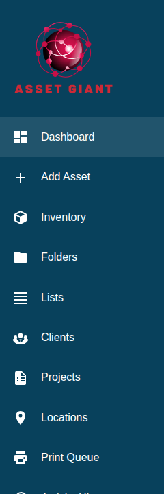
- Icons & Labels: The main menu items like Dashboard, Inventory, and Settings are always visible.
- Collapse/Expand: Use the arrow button at the bottom of the sidebar to collapse it to an icon-only view, giving you more screen space. Click it again to expand it. The app will remember your preference.
The Mobile Navigation Bar
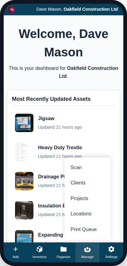
On a mobile phone, the sidebar is replaced by a simple navigation bar fixed to the bottom of the screen.
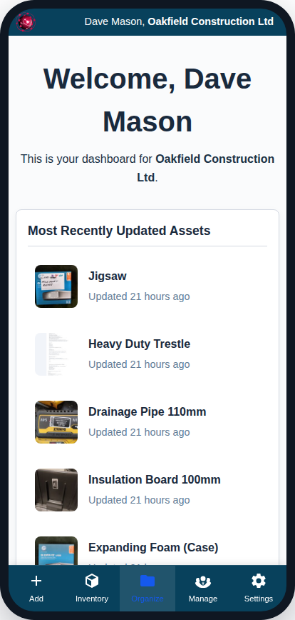
- Main Screens: The most common actions (Add, Inventory, Settings) have their own dedicated buttons.
- Popup Menus: To save space, other items are grouped into popup menus. Tap “Organize” to access your Folders and Lists. Tap “Manage” to access Clients, Projects, and Locations. A menu will appear above the button with these options.
The Global Top Banner
Visible on both desktop and mobile, the dark blue banner at the very top of the screen contains the User Menu.
- User Menu: Click on your name to open a dropdown menu. From here, you can quickly get to your Personal Profile settings or Log Out.